Revitalize visual identity of influential university.
TU Eindhoven
-
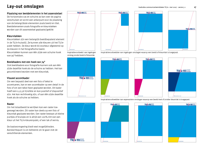
The sloping x-axis, derived from the slash in the logo, forms the cohesive graphic element in the style.
-
The intersection of the sloping x-axis with the horizontal axis creates skewed coloured areas.
-
The underlying design systematic explained in the visual identity guidelines.
-
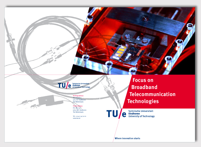
An abstract image relevant to the brochure’s topic was printed in UV lacquer on the cover.
-
Back and front cover of brochure with image printed in UV lacquer.
-
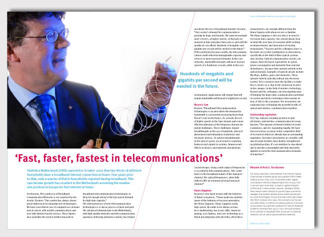
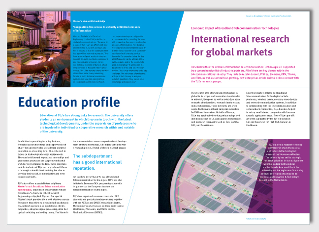
Interior spread of brochure, where sloping x-axis is a characteristic element as well.
-
Skewed coloured areas combined with sloping x-axis are dynamic graphic elements in the visual style.
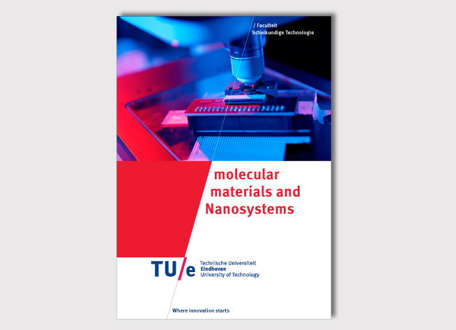
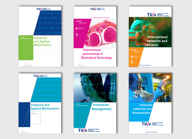
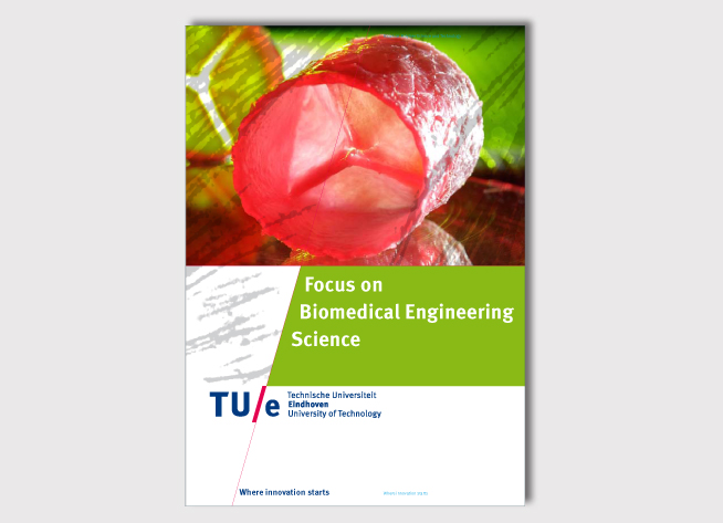
The main target of the Technical University Eindhoven (TU/e) was to be back on the map of influential and international universities, where everything revolves around innovation. A complete house style revitalization would be essential to accomplish this goal.
The renewed logo with a bilingual word mark underlines the international character of the university. The sloping x-axis, derived from the slash in the logo, forms the cohesive graphic element in the style. This sloping axis determines the placement of other graphic elements, such as the logo and pay-off. The intersection with the horizontal axis creates skewed coloured areas, which gives the style a dynamic look. Technological innovation is visualized by a colourful photography style and contemporary typography. The elaborate and bright colour palette offers plenty of possibilities to differentiate within the style.