Symbolize landscape, fluttering flag and tradition in a new identity.
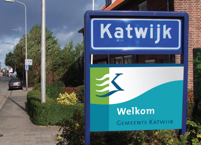
City of Katwijk
-
The fluttering flag, coast line and dune landscape are reflected in the visual identity.
-
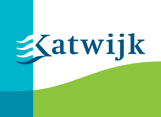
The characteristic dune landscape and water that surrounds Katwijk was an inspiration for the new logo.
-
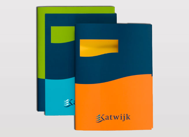
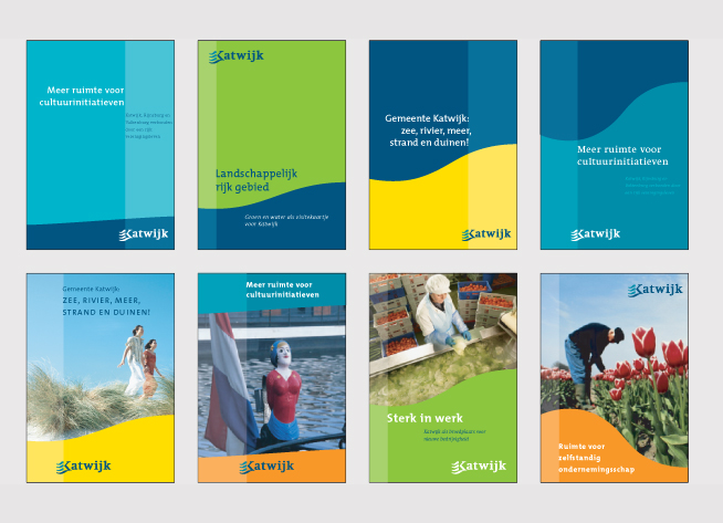
The curvy graphic language applied to presentation folders. The address window is die-cut.
-
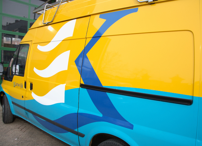
The visual identity included the design of vehicle lettering and boarding.
-
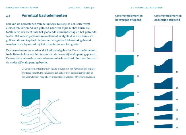
Visual identity manual. The curvy graphic language is derived from the ornamental initial cap of the logo.
-
The curving graphic shapes are combined with a contemporary color palette and photography.
The merger of the towns Katwijk, Rijnsburg and Valkenburg merged into one municipal ‘Katwijk’ led to the development of a completely new house style.
Their shared pride and feel for tradition, symbolized by a fluttering flag, was the starting point for the new logo. Furthermore the landscape full of water that surrounds all three towns—the North Sea, the Oude Rijn (Old Rhine), and the Valkenburg Lake—was an inspiration for the new logo. All these aspects are visualized into a powerful word mark with an ornamental initial cap.
The fluttering flag, the coast line and the characteristic dune landscape are also reflected in the graphic language derived from this ornamental cap. The new contemporary colour palette reflects the water, the dune landscape, the agriculture, flower fields and the Orange (royal family) societies. All the house style elements, such as: the logo, the colours, the authentic photography, the classic and modern typefaces and the curving graphic shapes underline the character of this new municipal.