Powerful visual identity with clear and direct communication.
Stadgenoot
-
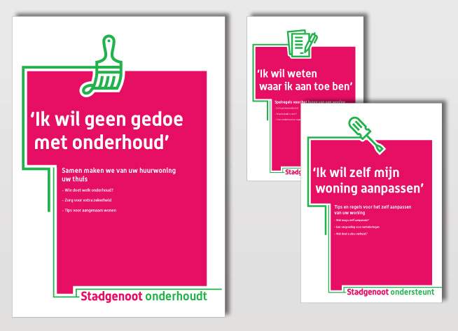
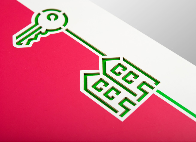
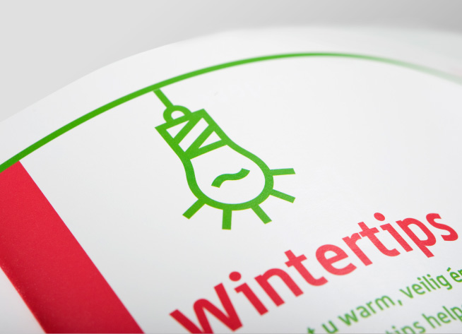
Thick lines and graphic icons on Stadgenoot’s brochures express a no-nonsense attitude.
-
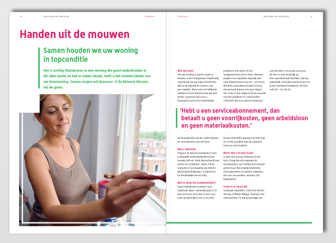
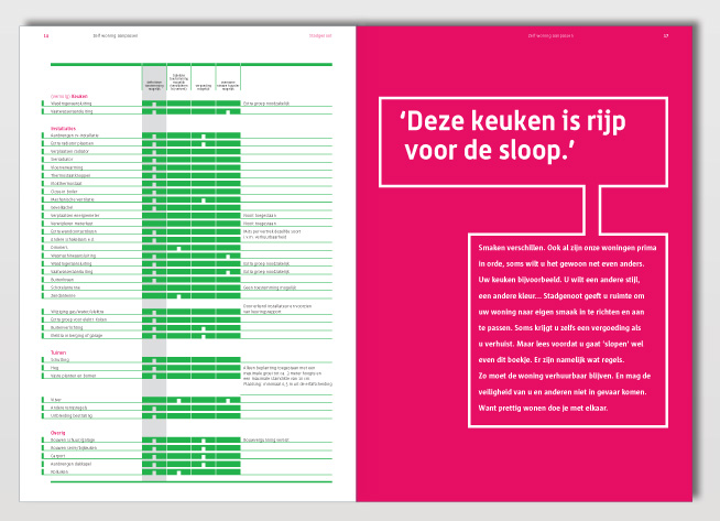
The graphic style and clarity in text is continued in the interior, combined with unpolished photography.
-
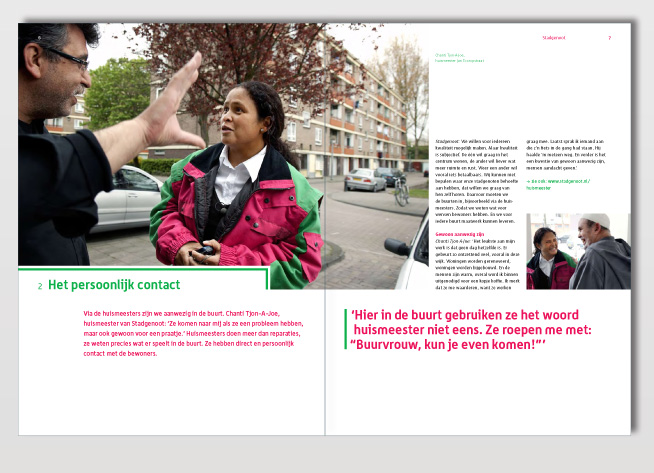
The needs of Stadgenoot’s tenants are verbalized by triggering quotes.
-
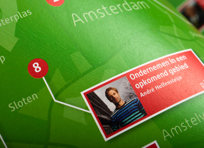
Corporate brochure with 10 personal city stories explain the ambition, vision and mission of Stadgenoot.
-
A neighbourhood custodian tells her story of Stadgenoot’s role in the city.
-
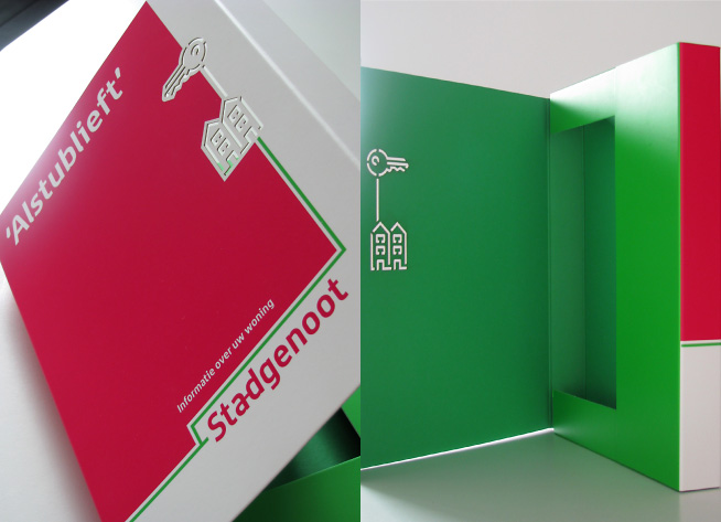
Presentation folder with various print embellishments to express quality, innovation and durability.
-
Icons in presentation folder are laser die cut so that coloured paper of interior shows through.
-
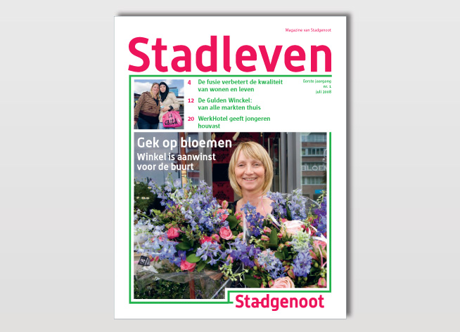
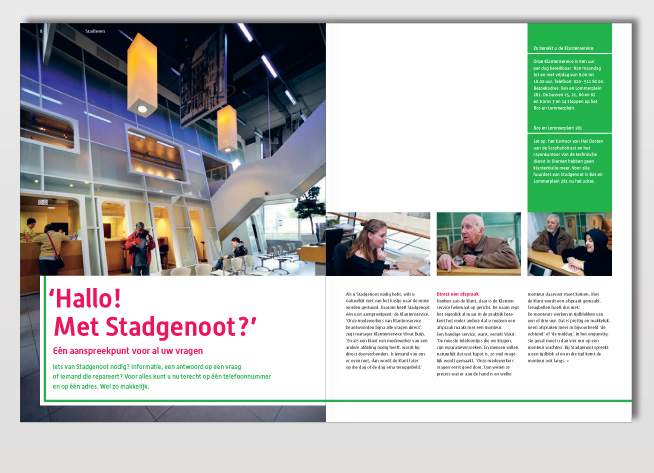
Editor’s formula and design for the tenants magazine ‘Stadleven’.
-
Magazine Stadleven is used to inform tenants and to express the brand profile.
-
The magazine’s warm and easy going appeal, reinforces the commitment and involvement with it’s tenants.
A complete new identity for the Amsterdam housing association Stadgenoot included: a new brand name, logo, brand strategy, visual identity and application to all means of communication. A challenging project in which a large team of various experts worked together. I was responsible for the constituent identity of the printed matter and the foundation of the image bank.
The result is a recognizable brand with a clear mission and powerful visual style. Their clear and direct graphic style differentiates by it’s straight-to-the-point communication without any ‘fuzz’. The connecting line, connected to the logo, is a characteristic element in the visual style. It visualizes the link between Stadgenoot and other city residents, clients and business partners. Because everything is connected and one must work together to create ‘a city to love’.
The graphic covers, ads and billboards are proprietary with their simple graphic icons and powerful graphic style. 60 icons were developed to complement this graphic language. The specifically developed text style has become an important brand element as well. The tone-of-voice is clear and straight-to-the-point. By triggering quotes in Amsterdam street language Stadgenoot shows that they know what’s at stake and how they address these issues.