Position Nuna as an upscale lifestyle brand for baby products.
Nuna
-
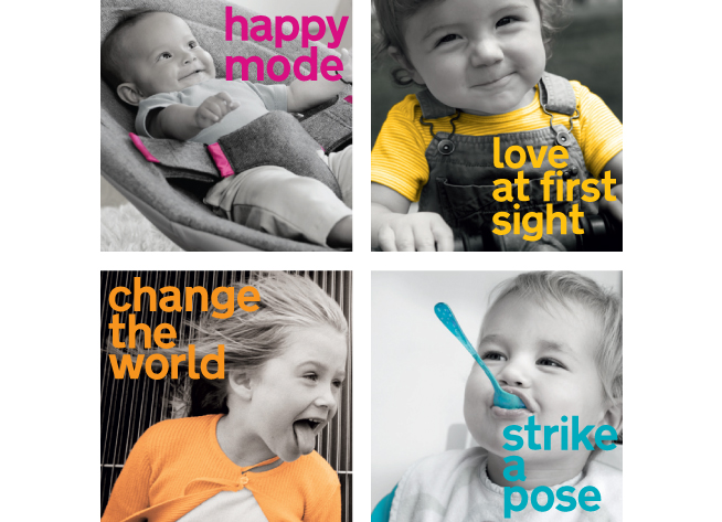
Nuna’s revised visual style applied to various media, like photo walls, postcards and press kit.
-
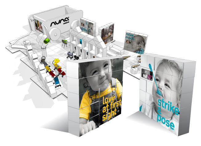
Photo walls in expo stand at Kind und Jugend-expo in Cologne.
-
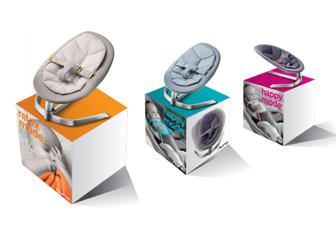
In-store displays with brand images for the Leaf, a stylish baby chair with a unique movement.
-
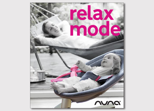
Cover of the Leaf brochure. Emphasis on the Leaf’s unique selling point: relaxing for baby and parents.
-
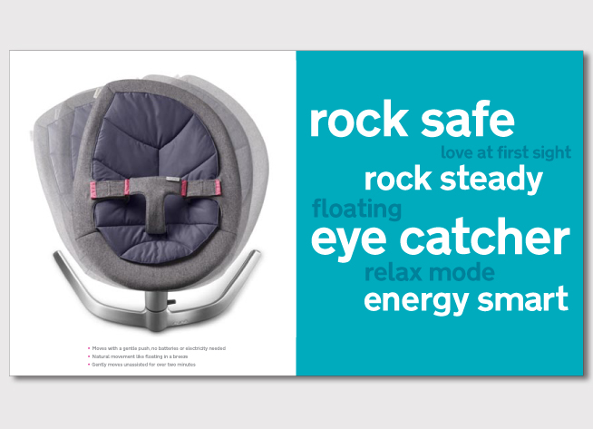
Spread of Leaf brochure, with typographic illustration of USP’s.
Nuna is a Dutch brand of baby products. Smart design pieces that children enjoy and make parents’ lives easier. Innovative and no-nonsense designs based on a realistic outlook on having children. Nuna’s products are differentiating, functional and stylish.
After upgrading the brand strategy, the visual style was revitalized. Gloomy black and white pictures of rebel kids were replaced by vibrant desaturated full colour images of playful children. Bright colour accents in the photography, catching headlines and colourful typography create a differentiating graphic style that positions Nuna as an upscale lifestyle brand.
The Leaf is a stylish baby chair with a unique movement. Nuna’s core design team came up with the photography concept in which the Leaf’s USPs are visualized by metaphors that refer to the rocking movement of the furniture piece. Combined with the graphic style, the brand images had been applied to various communication means which were presented on the Kind und Jugend-expo in Cologne in the fall of 2009, when Nuna’s Leaf was launched on the market.